Contrast Trim and Two-Tone Activewear: Building Brand Identity Without Relying on Prints
- Share
- Issue Time
- Sep 22,2026
Summary
A development guide for ODM and private label buyers building two-tone or contrast-trim women's activewear without relying on print. Covers why contrast details hold brand identity, panel/piping/binding options, colour and material compatibility, seam path and pattern alignment, sample approval points, and how bulk shade and seam consistency are controlled.
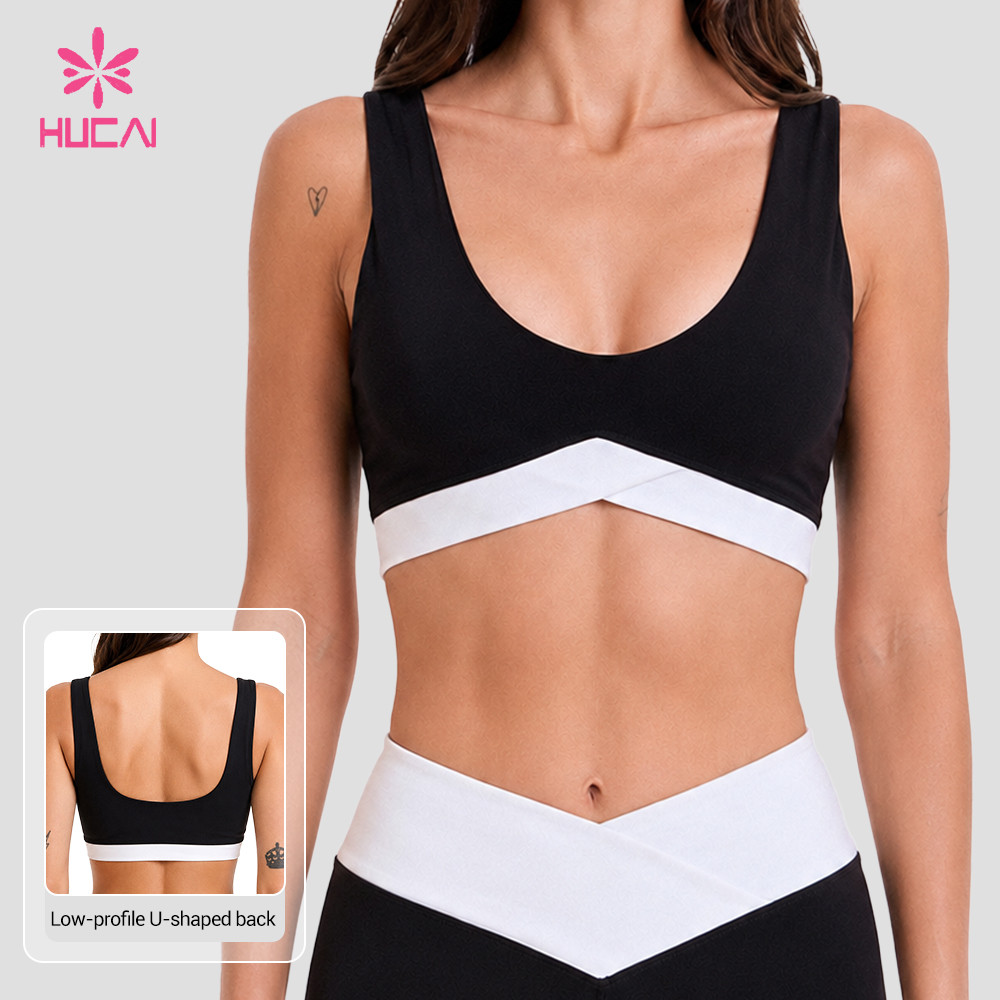
Across the Australian and Nordic women's training markets, a quiet shift is visible in current line-ups. Two-colour constructions and contrast trim are doing the work that full-surface prints used to do. Legging ranges now ship in named two-colour combinations, and constructions where a contrast binding wraps the waistband and follows the side seam appear as core styles rather than seasonal experiments. Printed surfaces have not disappeared, but they are no longer the only way a product reads as belonging to a brand.
For ODM and private label buyers, this is an attractive direction. It uses less artwork, fewer print approvals, and it travels better across seasons because it is built from structure rather than a graphic. It is also less forgiving. Contrast trim turns small manufacturing deviations into visible ones: a colour that reads slightly differently on two fabrics, a panel that sits two millimetres off, a trim that does not recover at the same rate as the body, or a shade that drifts between production lots.
This article breaks the category down as a development problem rather than a styling one. It reflects how HUCAI Sportswear approaches these programmes in practice: why contrast details hold identity, which construction options exist, how colour and material compatibility are reviewed, how seam paths are planned, what to check at sample stage, and how bulk consistency is protected once the style is approved.
Quick Answer
Two-tone and contrast-trim activewear builds strong brand identity with restrained design, but the category succeeds or fails on standardisation decided before the first sample is cut. The four variables that matter most are colour reference across different materials, trim construction and stretch compatibility, the seam path that carries the contrast, and the tolerance the factory is allowed to work within. Brands that define these four points in a written contrast detail brief typically move through sampling with fewer revision rounds, because the review shifts from subjective appearance to measurable placement and colour criteria.
Table of Contents
- Who This Article Is For
- Why Contrast Details Work — and Where They Fail
- Where Contrast Details Sit: Panel, Piping and Binding
- Colour and Material Compatibility
- Pattern Alignment and Seam Paths
- Sample Approval for Two-Tone Products
- Bulk Colour and Seam Consistency
- Decision Check
- Manufacturer Insight
- FAQ
- Final Takeaway
Who This Article Is For
- Primary reader: ODM and private label buyers building or refreshing a women's activewear range without relying on print.
- Secondary reader: Product developers, sourcing managers and designers who own the trim and colour specification for a two-tone style.
- Product stage: Pre-sampling and sampling — the stage where panel layout, trim type and colour standards are still cheap to change.
- Problem being solved: Contrast designs that look straightforward in a tech pack but show colour, alignment and shade deviation once samples and bulk arrive.
- Who may not need this article: Buyers running single-colour products with no applied trim, or brands purchasing finished stock rather than developing a custom style.
What you gain from this article: A construction-level view of how contrast trim and two-tone panels are specified, three practical checklists you can reuse across a range, and the questions to settle with a manufacturer before sampling starts rather than after the first fit review.
Why Contrast Details Work — and Where They Fail
Contrast detail creates recognition through construction instead of artwork. A binding in a second colour along a neckline, a waistband that shifts tone against the body, or a colour-blocked panel on a sports bra all produce a signature that survives across colourways, because the identity sits in the pattern and the trim rather than in a printed graphic. For a growing brand this reduces the number of decisions that have to be remade each season: the print does not need to be redrawn, and the product still reads as the same family.
There is a commercial advantage as well. Print development carries its own approval cycle, artwork files, colour separations and surface coverage decisions. A two-tone construction moves that effort into pattern and trim, which means the identity is reproducible from a cutting order and a trim specification rather than from a print run.
The difficulty is tolerance. In a single-colour garment, a small placement deviation is absorbed visually because tone and surface are continuous. Once two colours meet along a line, that line becomes the reference the eye follows. Deviation stops being texture and starts being a visible fault. This is why contrast styles require tighter written tolerances and a clearer seam path than plain garments, and why the specification work has to happen before the sample is cut rather than during review.
The categories where this shows up most are sports bras, leggings and matching sets, because the contrast line usually runs through an area of high stretch and high visibility. Development support for these categories is described under ODM and private label development, where HUCAI Sportswear reviews panel and trim decisions alongside pattern and fabric selection.
Where Contrast Details Sit: Panel, Piping and Binding
Contrast can be built in several ways, and each one carries a different construction cost and a different failure mode. Deciding which method a style uses is the first specification step, because the method determines how much of the pattern has to change and how the seam is finished.
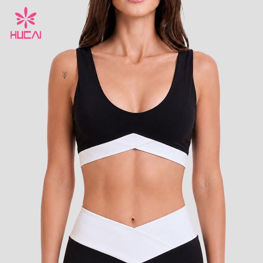
- Two-tone panel: A separate pattern piece in a second colour, joined to the body with a standard seam. It gives the largest surface contrast and the lowest trim cost, but the seam itself becomes the alignment line, so pattern accuracy and sewing control carry the whole effect.
- Piping: A narrow folded or corded strip inserted into a seam. It produces a thin, precise line that reads clearly against both colours. Piping requires the seam allowance and the piping width to be consistent along the whole path, and it is the option most sensitive to stretch behaviour.
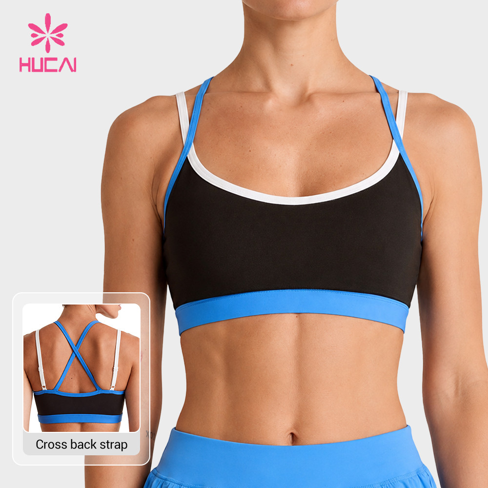
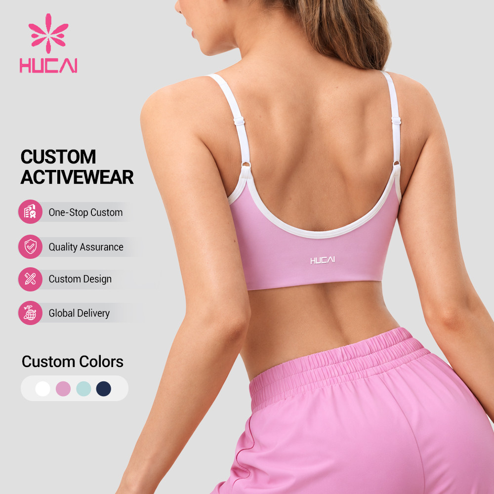
- Binding or edging: A strip folded over the raw edge and stitched in place. It finishes an opening and adds contrast at the same time, which makes it efficient on necklines, armholes, waistbands and leg openings. Because the binding is a separate elastic or knit, its recovery has to be reviewed against the body fabric.
- Contrast elastic or tape: A woven or knitted tape applied at the waistband or underband. Width is fixed by the supplier, so the visual weight is predictable, but the tape's stretch direction has to match the direction the band is pulled during wear.
The practical question is how many contrast details the style should carry. Each additional contrast line adds a decision about colour, width, stretch behaviour and placement, and each one is a place where deviation becomes visible. A restrained construction — one clear contrast element per garment, well placed — usually reviews faster than a design that stacks several.
Colour and Material Compatibility
The second specification step is colour reference. A single colour named on a brief will not appear identical once it is applied to different materials, because fabric surface, yarn type and dyeing method all influence how the eye reads tone. A contrast colour applied to a matte knit, a mesh insert, and a shiny elastic will read as three related but distinct tones under the same lighting. Deciding the colour standard therefore means deciding it material by material, not once for the whole garment.
Where a brand wants a colour to bridge materials, the usual approach is to nominate which material owns the standard and to review the others against it. In practice this means the agent reviews the contrast colour on each material under one agreed light source, and records the accepted variation rather than discovering it on the sample. Where a brand wants a stronger effect, deliberately assigning different finishes to the same colour — matte against a lightly sheened surface — can create separation without introducing a second dye lot.
Stretch compatibility is the second half of this step and the one most often under-specified. A contrast trim that does not recover at the same rate as the body will pull or ripple along its seam, and the stronger the contrast, the more visible that ripple becomes. This is why the specification should record the intended stretch direction and recovery requirement for both the body fabric and the trim, and confirm that they are compatible before sampling. Where the base fabric is a smooth construction with a high stretch requirement, a trim with a similar stretch character is usually easier to control than a firm woven tape.
Material options are reviewed at the development stage, including recycled or certified material options that can be reviewed based on project requirements, so that the colour and stretch decisions are made against materials the project can actually use. Fabric behaviour and selection criteria for these categories are covered in more detail in the activewear fabric selection process.
Pattern Alignment and Seam Paths
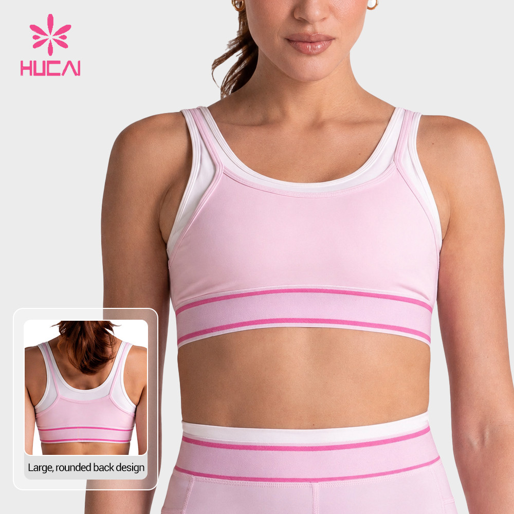
Once colour and material are settled, the contrast has to be placed accurately, and that is a pattern question before it is a sewing question. The seam path — the route the contrast line follows through the garment — determines where the colours meet, how the line behaves through curves and how it lands at junctions such as a strap meeting a neckline or a side seam meeting a waistband.
Two decisions belong here. The first is whether the contrast line should run continuously or resolve at a defined point. A binding that continues uninterrupted around a neckline produces a different visual rhythm from one that stops at a strap junction, and both need to be drawn on the pattern rather than agreed verbally. The second is how the line behaves across different sizes. Because a contrast seam is scaled with the pattern, its position on a small size and a large size will not be proportionally identical, so graded placement has to be reviewed rather than assumed.
Contrast also increases the cost of a curve. A straight contrast line is relatively tolerant; a line that turns through an armhole, crosses a bust seam or forms a V at the centre front concentrates deviation at the turning point. That is why the specification should identify the junctions where the contrast has to resolve precisely, and confirm the acceptable tolerance at those points rather than applying one tolerance figure to the whole path.
The number that matters when this is discussed with a factory is small. Contrast turns an alignment error that would be invisible in a single-colour garment into an obvious one, so the practical tolerance at visible junctions is typically tighter than what a plain style would accept. The full production expectations for these categories, including the checkpoints applied during inspection, are described under sportswear quality control.
Sample Approval for Two-Tone Products
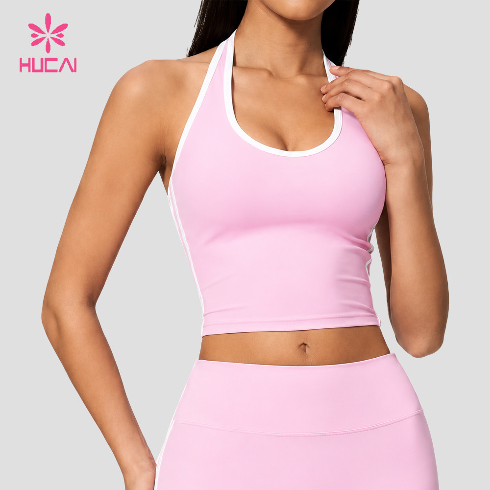
A two-tone sample should be reviewed against the written specification rather than against the look of the garment alone, because appearance-based review is what produces repeat revision rounds. The review is more efficient when it is split into fixed points that can each be answered yes or no.
- Trim width and placement: Measure the contrast element at several points along its path, not only at the widest or most visible section. A piping or binding that measures correctly at the front but narrows at the armhole has a construction cause, and it is cheaper to find it on the sample than in bulk.
- Colour under agreed light: Check the contrast colour on each material against the recorded standard, under the light source named in the brief. Reviewing materials separately is what catches the case where one fabric reads a tone apart from the others.
- Alignment at junctions: Confirm that the contrast resolves cleanly where lines meet — centre front, strap junctions, side seam to waistband. These are the points where deviation concentrates.
- Movement and recovery: Wear-test or stretch the sample along the contrast seam to confirm the trim recovers with the body and does not ripple or pull the panel. This is the check that most often reveals a stretch mismatch.
- Finish at the ends: Confirm how the contrast terminates — at a seam, under a fold, or at an edge — and that the termination looks intentional from both sides.
Sample timing is worth planning around these checks rather than after them. Where the brief is complete and materials are confirmed, a development sample usually takes about 10-15 days, which leaves room for a structured review, and for one revision cycle if a junction or a trim behaviour needs adjusting, before bulk is discussed.
Contrast styles also benefit from reviewing the category in context. A bra and its matching bottom are usually specified together for a coordinated capsule, so the contrast ratio and trim type applied to one should be consistent with the other. References for this category are collected under custom matching sets, and the individual products show how contrast has been applied at panel, band and edge level in sports bra development and leggings development.
Bulk Colour and Seam Consistency
The final stage is protecting the approved standard once the style moves into production. Two things drift in a two-tone programme: shade and stitch placement. Both are manageable, but only if the control method is agreed before bulk, because neither can be corrected after the garments are cut.
Shade control starts with an approved standard that is referenced to physical material rather than to a screen image. Because the contrast colours sit on different materials, the approved standard should carry a reference for each material, and bulk delivery should be checked against those references under the same conditions used at approval. Where a programme runs across several production windows, keeping one nominated reference per material removes the ambiguity that appears when each lot is compared only to the previous one.
Stitch and placement consistency is where contrast shows most clearly in bulk. Because the contrast line is the visual reference, deviation between garments in the same order is more noticeable than absolute deviation would be in a plain style. The usual protection is to fix the sewing sequence and the machine setup for the contrast operation, treat the contrast seam as a controlled operation rather than a general one, and include the contrast measurements in inspection alongside the standard checks. Trims are also a variable to lock down: a trim supplier change mid-programme can shift width or recovery enough to disturb the approved appearance.
Where a brand runs a continuous programme across colourways, this control is also what makes the range feel coherent, because the same contrast logic is reproduced rather than reinterpreted. A partner set up for OEM execution handles this through documented operation standards, while ODM development runs it through the pattern and trim specification agreed at approval. Buyers who want to discuss the control method for a specific style can review the requirements through contact.
Decision Check: The Contrast Detail Brief
Before requesting samples, confirm the following seven points. They form the written brief that a factory needs in order to build a two-tone style without guessing:
- Base colour: The nominated body colour, recorded with the material it is approved on.
- Contrast ratio: How strong the intended separation is, and whether it should read as a clear break or a subtle shift.
- Trim type: Panel, piping, binding, tape or contrast elastic — chosen as a construction method, not as a visual reference alone.
- Stretch compatibility: The intended stretch direction and recovery requirement for the body fabric and the trim, and confirmation that they are compatible.
- Seam path: The route the contrast line follows, and the junction points where it has to resolve precisely.
- Logo colour: Whether the brand mark sits on the body colour or the contrast colour, and how it reads against each.
- Acceptable tolerance: The placement tolerance allowed at visible junctions, stated numerically rather than agreed by appearance.
If five or more of these points are confirmed in writing, the direction is ready for a structured sample request. If fewer than five are resolved, the missing points will typically surface as revision rounds during sampling, which is the more expensive place to settle them.
Planning a two-tone development? If you are specifying a contrast-trim style and want the panel layout, trim type, colour standard and tolerance reviewed before the first sample is cut, that review is part of ODM and private label development. Bringing the brief to that stage first usually shortens the sampling cycle rather than lengthening it.
Manufacturer Insight
Contrast colour magnifies placement error. A deviation of two to three millimetres that would pass unnoticed in a single-colour garment becomes a visible line defect the moment two colours meet, because the eye reads the boundary as the reference rather than the surface. This is why pattern matching and sewing control are more sensitive in two-tone products than in tonal ones, and why the tolerance has to be written into the brief instead of judged at review.
In practice, the styles that move smoothly through development are the ones where the contrast element is treated as a controlled operation from the start: one clear contrast line per garment, a seam path that is drawn and graded rather than agreed verbally, a colour standard recorded per material, and a trim whose stretch behaviour has been confirmed against the body fabric before cutting. When those four are in place, the sample review becomes a measurement exercise, and the conversation moves quickly from appearance to placement.
HUCAI Sportswear works with brands on fabric and trim customisation, sample development and colour review as part of the development process, with AQL-based inspection applied as part of the quality workflow.
FAQ
Is contrast binding suitable for stretch activewear?
It can be, when the binding's recovery is matched to the body fabric it sits against. The difficulty is not the binding itself but the difference in behaviour: if the binding recovers at a different rate from the panel it edges, the seam will pull or ripple, and contrast makes that more visible. The practical approach is to nominate the binding's stretch direction and recovery requirement in the brief and review both materials together at sample stage rather than after approval.
How can piping affect garment stretch?
Piping is inserted into a seam, so it adds a relatively firm line at that point. If the piping is less extensible than the surrounding fabric, it restricts movement along that seam, which can show as a stiff line across a high-stretch area or as a slight pull in the panel beside it. Reviewing the piping against the intended stretch direction, and confirming how much give the seam needs, is what keeps the construction comfortable as well as visually clean.
How should two-tone colours be approved?
Material by material, under one agreed light source. A single colour applied to a matte knit, a mesh insert and an elastic will not read identically, because surface and dyeing method both affect perceived tone. The usual method is to nominate which material owns the colour standard, review each other material against it, and record the accepted variation rather than waiting to discover it on a finished sample.
What causes seam mismatch?
Most mismatches come from the pattern and the sewing operation rather than the fabric. A seam path that was agreed as an image rather than drawn and graded, a contrast line that turns through a curve without a defined resolution point, or a sewing sequence that is not fixed for the contrast operation will each produce placement variation between garments. Because contrast turns millimetre deviation into a visible line, these causes become apparent in a two-tone style much sooner than in a tonal one.
Can different fabrics share one colour standard?
They can share an intent, but not a single reference. Different materials take up colour differently and reflect light differently, so one reference applied across several fabrics usually produces a visual mismatch that is only noticed at review. The more reliable method is one reference per material, all approved under the same conditions, so that batch comparison stays meaningful across a programme.
How can bulk shade variation be reduced?
By fixing the reference and the controlled operations before bulk begins. That means an approved standard held on physical material for each fabric and trim, one nominated reference per material across production windows, a fixed sewing sequence and machine setup for the contrast seam, and contrast measurements included in the inspection checklist. Changing a trim supplier mid-programme is one of the more common causes of an unexpected shift, because width and recovery can move even when the colour is correct.
How many contrast details should a first two-tone style include?
One clear contrast element per garment is usually the better starting point. Each additional contrast line adds its own colour decision, width decision, stretch consideration and placement tolerance, and each becomes a place where deviation is visible. A restrained construction that is well placed reads as intentional and reviews faster, and further contrast can be added in later developments once the first construction is controlled.
What should be in a contrast detail brief before sampling?
Seven points: base colour, contrast ratio, trim type, stretch compatibility, seam path, logo colour and the acceptable placement tolerance. The value of writing them down is that it converts the sample review from a discussion about appearance into a check against criteria. Where five or more points are confirmed, sampling normally progresses without the direction being reopened; where they are not, the gaps usually reappear as revision rounds.
Final Takeaway
Two-tone construction and contrast trim give a women's activewear brand a recognisable signature without committing the range to print development. The trade-off is tolerances: the moment two colours meet, the boundary becomes the reference the eye follows, and deviation that would be invisible on a tonal garment becomes a visible fault. That does not make the category difficult to run, but it makes it a specification-led one. Settle the base colour, contrast ratio, trim type, stretch compatibility, seam path, logo colour and acceptable tolerance in writing, review the sample against those criteria rather than against appearance, and fix the shade reference and contrast operation before bulk. Handled that way, contrast detail is a repeatable identity system rather than a source of revision rounds.
About HUCAI Sportswear
- Founded in 1998, specialising in women's activewear and sportswear manufacturing
- OEM and ODM development support for sports bras, leggings, shorts, tops and matching sets
- Fabric and trim customisation with structured sample development and sample-to-bulk consistency control
- Colour review and AQL-based inspection applied as part of the quality workflow
Minimum order quantity starts from 200 pcs per style. Development samples usually take about 10-15 days, and bulk production often takes about 25-30 days once materials and approvals are confirmed.
Current certification information can be reviewed during supplier evaluation based on the project and documentation requirements. Recycled or certified material options can be reviewed based on project requirements.
To discuss a two-tone or contrast-trim development, use the contact page and share your brief.